finlab.plot
finlab.plot.plot_tw_stock_candles
plot_tw_stock_candles(stock_id, recent_days=400, adjust_price=False, resample='D', overlay_func=None, technical_func=None)
繪製台股技術線圖圖組
Args:
stock_id (str): 台股股號,ex:'2330'。
recent_days (int):取近n個交易日資料。
adjust_price (bool):是否使用還原股價計算。
resample (str): 技術指標價格週期,ex: D 代表日線, W 代表週線, M 代表月線。
overlay_func (dict):
K線圖輔助線,預設使用布林通道。
from finlab.data import indicator

overlay_func={
             'ema_5':indicator('EMA',timeperiod=5),
             'ema_10':indicator('EMA',timeperiod=10),
             'ema_20':indicator('EMA',timeperiod=20),
             'ema_60':indicator('EMA',timeperiod=60),
            }
    設定多組技術指標:
    ```py
    from finlab.data import indicator

    k,d = indicator('STOCH')
    rsi = indicator('RSI')
    technical_func = [{'K':k,'D':d},{'RSI':rsi}]
    ```
| RETURNS | DESCRIPTION |
|---|---|
Figure
|
技術線圖 |
Examples:
from finlab.plot import plot_tw_stock_candles
from finlab.data import indicator

overlay_func={
              'ema_5':indicator('EMA',timeperiod=5),
              'ema_10':indicator('EMA',timeperiod=10),
              'ema_20':indicator('EMA',timeperiod=20),
              'ema_60':indicator('EMA',timeperiod=60),
             }
k,d = indicator('STOCH')
rsi = indicator('RSI')
technical_func = [{'K':k,'D':d},{'RSI':rsi}]
plot_tw_stock_candles(stock_id='2330',recent_days=600,adjust_price=False,overlay_func=overlay_func,technical_func=technical_func)
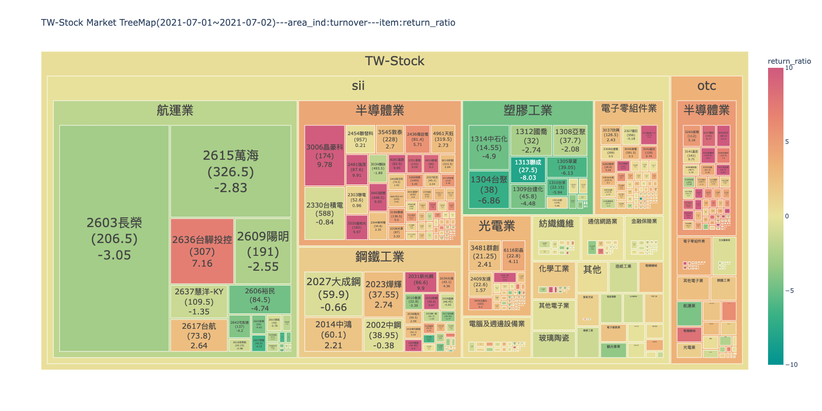
finlab.plot.create_treemap_data
產生台股板塊圖資料
產生繪製樹狀圖所用的資料,可再外加FinLab資料庫以外的指標製作客製化DataFrame,
並傳入plot_tw_stock_treemap(treemap_data=treemap_data)。
| PARAMETER | DESCRIPTION |
|---|---|
start |
資料開始日,ex:
TYPE:
|
end |
資料結束日,ex:
TYPE:
|
item |
決定板塊顏色深淺的指標。
除了可選擇依照 start 與 end 計算的
TYPE:
|
clip |
將item邊界外的值分配給邊界值,防止資料上限值過大或過小,造成顏色深淺變化不明顯。 ex:(0,100),將數值低高界線,設為0~100,超過的數值。 Note 參考pandas文件更了解
TYPE:
|
| RETURNS | DESCRIPTION |
|---|---|
DataFrame
|
台股個股指標 |
Examples:
欲下載所有上市上櫃之價量歷史資料與產業分類,只需執行此函式:

``` py
from finlab.plot import create_treemap_data
create_treemap_data(start= '2021-07-01',end = '2021-07-02')
```

| stock_id   |  close |turnover|category|market|market_value|return_ratio|country|
|:-----------|-------:|-------:|-------:|-------:|-------:|-------:|-------:|
| 1101       |   20 |  57.85 |  水泥工業 |  sii   |    111  |    0.1  |  TW-Stock|
| 1102       |  20 |  58.1  |  水泥工業 |  sii    |    111  |    -0.1 |  TW-Stock|
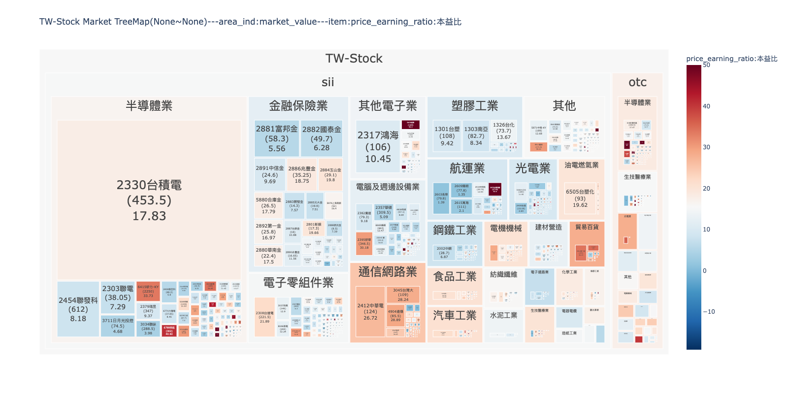
finlab.plot.plot_tw_stock_treemap
plot_tw_stock_treemap(start=None, end=None, area_ind='market_value', item='return_ratio', clip=None, color_continuous_scale='Temps', treemap_data=None)
繪製台股板塊圖資料
巢狀樹狀圖可以顯示多維度資料,將依照產業分類的台股資料絢麗顯示。
| PARAMETER | DESCRIPTION |
|---|---|
start |
資料開始日,ex:
TYPE:
|
end |
資料結束日,ex:
TYPE:
|
area_ind |
決定板塊面積數值的指標。
可選擇
TYPE:
|
item |
決定板塊顏色深淺的指標。
除了可選擇依照 start 與 end 計算的
TYPE:
|
clip |
將 item 邊界外的值分配給邊界值,防止資料上限值過大或過小,造成顏色深淺變化不明顯。 ex:(0,100),將數值低高界線,設為 0~100,超過的數值。 Note 參考pandas文件更了解
TYPE:
|
color_continuous_scale |
TYPE:
|
treemap_data |
客製化資料,格式參照
TYPE:
|
Returns: (plotly.graph_objects.Figure): 樹狀板塊圖 Examples: ex1: 板塊面積顯示成交金額,顏色顯示'2021-07-01'~'2021-07-02'的報酬率變化,可以觀察市場資金集中的產業與漲跌強弱。
from finlab.plot import plot_tw_stock_treemap
plot_tw_stock_treemap(start= '2021-07-01',end = '2021-07-02',area_ind="turnover",item="return_ratio")
 ex2:
板塊面積顯示市值(股本*收盤價),顏色顯示近期本益比,可以觀察全市場哪些是權值股?哪些產業本益比評價高?限制數值範圍在(0,50),
將過高本益比的數值壓在50,不讓顏色變化突兀,能分出高低階層即可。
ex2:
板塊面積顯示市值(股本*收盤價),顏色顯示近期本益比,可以觀察全市場哪些是權值股?哪些產業本益比評價高?限制數值範圍在(0,50),
將過高本益比的數值壓在50,不讓顏色變化突兀,能分出高低階層即可。
from finlab.plot import plot_tw_stock_treemap
plot_tw_stock_treemap(area_ind="market_value",item="price_earning_ratio:本益比",clip=(0,50), color_continuous_scale='RdBu_r')
finlab.plot.plot_tw_stock_radar
plot_tw_stock_radar(portfolio, feats=None, mode='line_polar', line_polar_fill=None, period=None, cut_bins=10, title=None, custom_data=None)
繪製台股雷達圖
比較持股組合的指標分級特性。若數值為nan,則不顯示分級。
| PARAMETER | DESCRIPTION | ||||||||||||
|---|---|---|---|---|---|---|---|---|---|---|---|---|---|
portfolio |
持股組合,ex:
TYPE:
|
||||||||||||
feats |
選定FinLab資料庫內的指標組成資料集。預設為18項財務指標。 ex:['fundamental_features:營業毛利率','fundamental_features:營業利益率']
TYPE:
|
||||||||||||
mode |
雷達圖模式 ,ex:'bar_polar','scatter_polar','line_polar'`。 Note 參考不同模式的差異
TYPE:
|
||||||||||||
line_polar_fill |
將區域設置為用純色填充 。ex:
TYPE:
|
||||||||||||
period |
選擇第幾期的特徵資料,預設為近一季。 ex: 設定數值為'2020-Q2,取得2020年第二季資料比較。
TYPE:
|
||||||||||||
cut_bins |
特徵分級級距。
TYPE:
|
||||||||||||
title |
圖片標題名稱。
TYPE:
|
||||||||||||
custom_data |
客製化指標分級,欄名為特徵 格式範例:
TYPE:
|
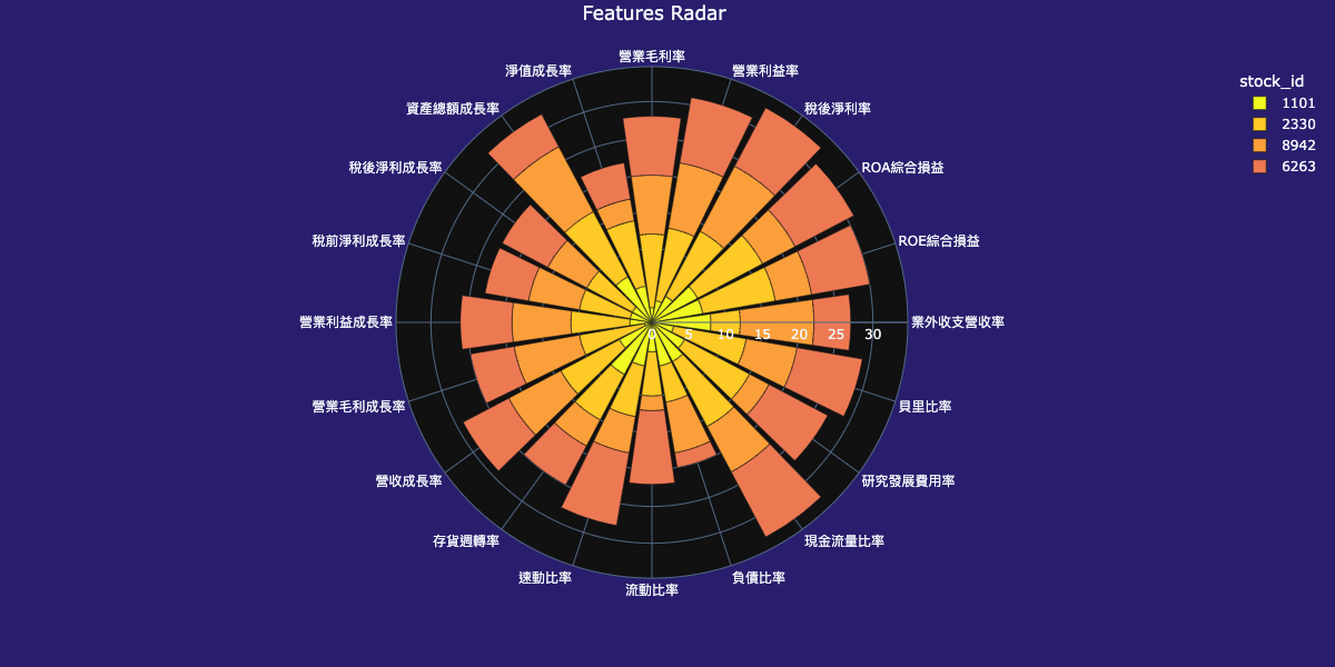
Returns: (plotly.graph_objects.Figure): 雷達圖 Examples: ex1:比較持股組合累計分數,看持股組合偏重哪像特徵。
from finlab.plot import plot_tw_stock_radar
plot_tw_stock_radar(portfolio=["1101", "2330", "8942", "6263"], mode="bar_polar", line_polar_fill='None')
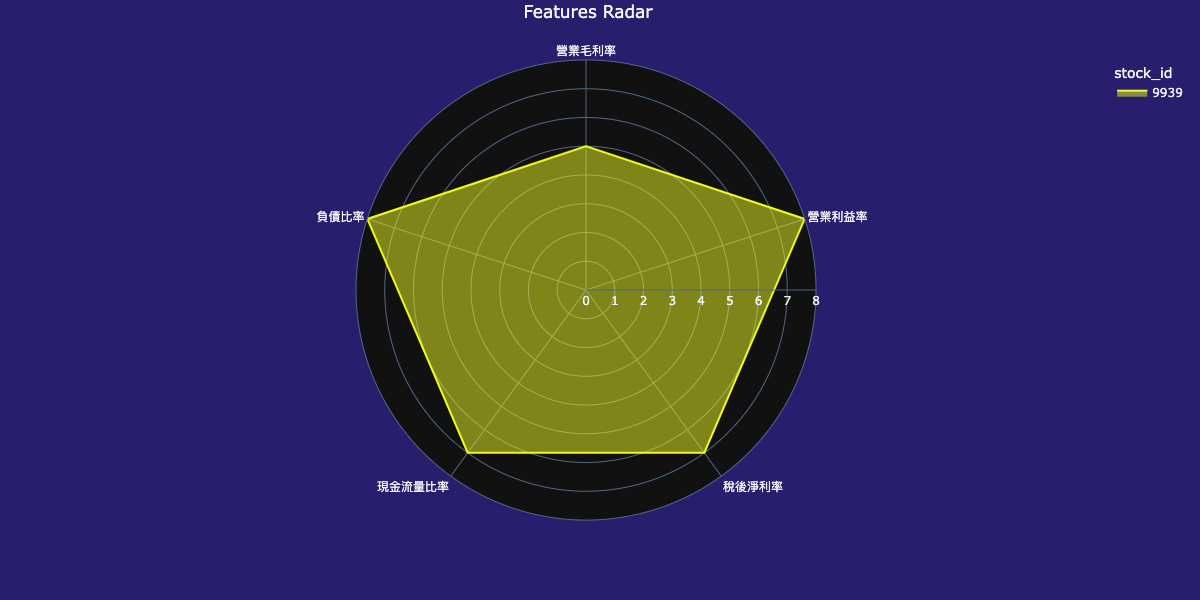
 ex2:看單一個股特徵分級落點。
from finlab.plot import plot_tw_stock_radar
feats = ['fundamental_features:營業毛利率', 'fundamental_features:營業利益率', 'fundamental_features:稅後淨利率',
         'fundamental_features:現金流量比率', 'fundamental_features:負債比率']
plot_tw_stock_radar(portfolio=["9939"], feats=feats, mode="line_polar", line_polar_fill='toself', cut_bins=8)
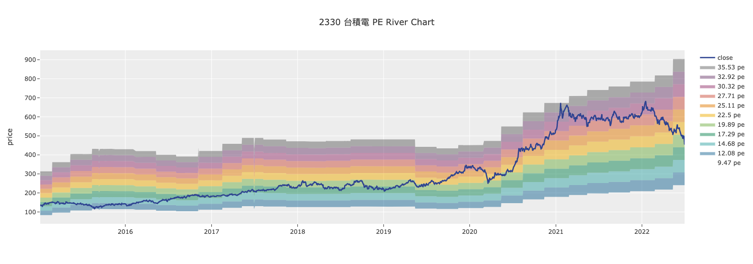
finlab.plot.plot_tw_stock_river
繪製台股河流圖
使用 PE or PB 的最高與最低值繪製河流圖,判斷指標所處位階。
| PARAMETER | DESCRIPTION |
|---|---|
stock_id |
台股股號,ex:
TYPE:
|
start |
資料開始日,ex:
TYPE:
|
end |
資料結束日,ex:
TYPE:
|
mode |
TYPE:
|
split_range |
河流階層數。
TYPE:
|
Returns: (plotly.graph_objects.Figure): 河流圖 Examples:
from finlab.plot import plot_tw_stock_river
plot_tw_stock_river(stock_id='2330', start='2015-1-1', end='2022-7-1', mode='pe', split_range=10)
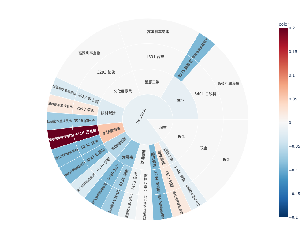
finlab.plot.StrategySunburst
繪製策略部位旭日圖
監控多策略。
get_strategy_df
獲取策略部位與分配權重後計算的資料
| PARAMETER | DESCRIPTION |
|---|---|
select_strategy |
選擇策略名稱並設定權重,預設是抓取權策略並平分資金比例到各策略。
ex:
TYPE:
|
Returns: (pd.DataFrame): strategies data
plot
繪圖
| PARAMETER | DESCRIPTION |
|---|---|
select_strategy |
選擇策略名稱並設定權重,預設是抓取權策略並平分資金比例到各策略。
ex:
TYPE:
|
path |
旭日圖由裡到外的顯示路徑,預設為
TYPE:
|
color_continuous_scale |
TYPE:
|
| RETURNS | DESCRIPTION |
|---|---|
Figure
|
策略部位旭日圖 |
Examples:
from finlab.plot import StrategySunburst

# 實例化物件
strategies = StrategySunburst()
strategies.plot().show()
strategies.plot(select_strategy={'高殖利率烏龜':0.4,'營收強勢動能瘋狗':0.25,'低波動本益成長比':0.2,'現金':0.15},path =  ['market', 'category','stock_id','s_name']).show()
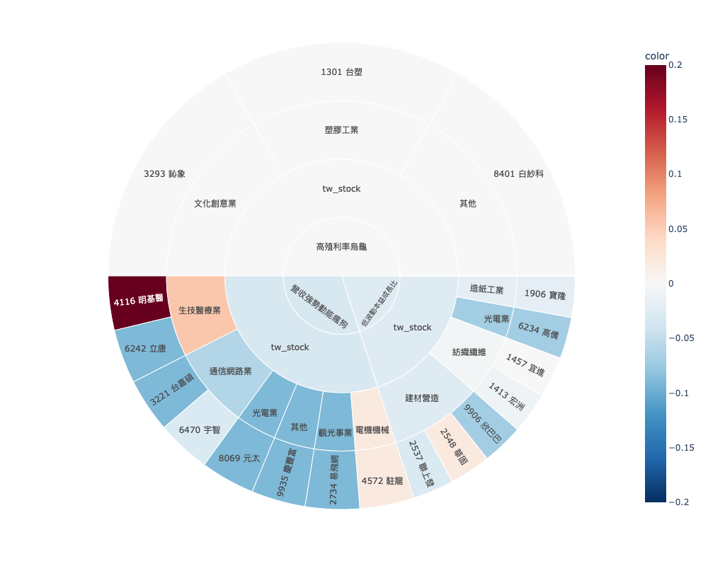
ex2:部位被哪些策略選到,標的若被不同策略選到,可能有獨特之處喔!
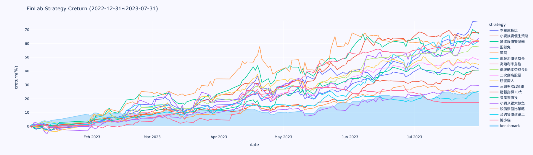
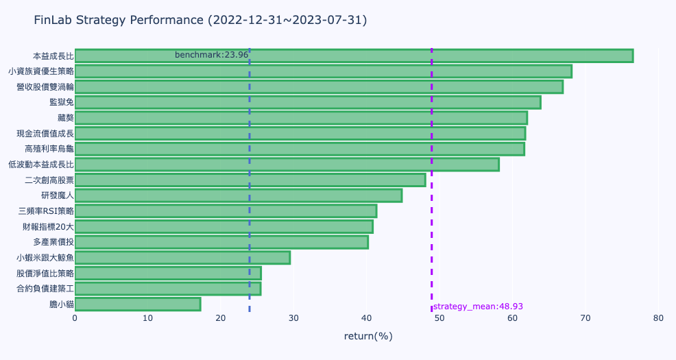
finlab.plot.StrategyReturnStats
繪製策略報酬率統計比較圖
監控策略群體相對對標指數的表現。
| PARAMETER | DESCRIPTION |
|---|---|
start_date |
報酬率計算開始日
TYPE:
|
end_date |
報酬率計算結束日
TYPE:
|
strategy_names |
用戶本人的策略集設定,填入欲納入統計的策略名稱,只限定自己的策略。ex:
TYPE:
|
benchmark_return |
策略比對基準序列,預設為台股加權報酬指數。
TYPE:
|
Examples:
統計2022-12-31~2023-07-31的報酬率數據
``` py
# 回測起始時間
start_date = '2022-12-31'
end_date  = '2023-07-31'

# 選定策略範圍
strategy_names = ['膽小貓','三頻率RSI策略', '二次創高股票', '低波動本益成長比', '合約負債建築工', '多產業價投', '小蝦米跟大鯨魚', '小資族資優生策略', '本益成長比', '營收股價雙渦輪', '現金流價值成長', '研發魔人', '股價淨值比策略', '藏獒', '高殖利率烏龜','監獄兔', '財報指標20大']

report = StrategyReturnStats(start_date ,end_date, strategy_names)
# 繪製策略報酬率近期報酬率長條圖
report.plot_strategy_last_return().show()
# 繪製策略累積報酬率時間序列
report.plot_strategy_creturn().show()
```
plot_strategy_creturn
繪製策略累積報酬率時間序列
Returns:
(plotly.graph_objects.Figure): 圖表物件